10 Web Design Trends To Look Out For In 2022
BY ITW Consulting
Web Design and Development
A website has become one of the very first interactions with prospective customers for almost every business. Because of this, it’s become one of the most influential assets too. Your website needs to be well designed not only to attract new customers but also to better position your brand and company within the competitive industry. The design of your site plays a critical role in determining how effective it is for your company. You need a design that not only stands out, but that is well optimized for better rankings, fluid navigation, and a good overall browsing experience. If your design is not up to par, you can bank on many visitors bouncing off it onto a competitor’s site. This is the last thing you want. The key is staying ahead of the curve and knowing what trends are popular at the current time and shortly in the future. Staying abreast of the latest web design trends can help you better design your website for success in 2022. Below, you will find some of the top web design trends to pay attention to for 2022 and beyond.
Top Web Design Trends For 2022 And Beyond:
Clean Designs
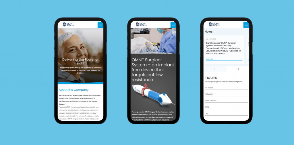
The current trend is shifting from putting everything you can into it to leaving out the fluff. While it’s not a complete shift to minimalism as we know it, designers are starting to go with the “less-is-more” approach to their designs. You are starting to see a lot of designs leverage cleaner and sleeker elements. These elements have removed unwanted and unneeded layers or depth. The key is maintaining a sleek and minimalistic appearance but retaining defined yet bold designs into something that provides a smoother overall browsing experience.

Symmetrical Layouts
This has been important since the beginning of time when it comes to clean designs. There have been times when asymmetric layouts have had their time in the sun, but that’s beginning to fade. We are back to an era where symmetry is king when it comes to design and layout. The beauty of having a symmetrical layout is the ability to focus more attention on aspects of your site that you want visitors’ eyes to look at. This not only makes for a cleaner design, but it helps with optimizing conversions of calls to action. Thus, you’ll want to leverage things like grid layouts and balancing the photos and text you have on your site.
Serif And Lightweight Typography
Typography has always played a key role in design language. The typography used on your site can make or break its overall design. You will find a lot of brands ushering in cleaner and more elegant fonts like Serif. There is a trend where more and more designers are starting to use their respective typefaces as a means to create a bolder design rather than with colors and creating a vibrant aesthetic. This coincides with the trend shift back towards minimalism.
Earthy And Primary Colors
As you go from site to site, you will notice more and more of them leveraging earthy colors and tones. This is an intentional shift as an increasing number of brands are starting to understand the shift in consumer mindset. After all, more consumers have become eco-conscious than ever before. As a result, a lot of brands are looking to better position their company’s in a way that positions them in an eco-conscious way. A good way to do this is by featuring earthy hues on your site. This can help create a sustainable look for your brand which can improve your brand’s perception throughout the marketplace. There will always be room for stylish neon palettes being used, but everything is going to be carefully integrated into the mix.
Images Of Real People
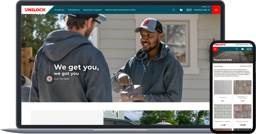
This is a big shift that’s happening in front of our eyes. The idea of only showcasing perfection is no longer. A lot of brands are starting to shift towards focusing on real people. This includes brands that nailed down on only showcasing people that met current beauty ideals previously. Inclusivity has become one of the primary buzzwords in the real world and it’s only going to get ushered more into the design world as we move forward. Even big fashion brands and outlets have started to feature real people on their websites. This is a trend that is expected to continue moving forward in a big way.

3D Motion Elements
This is a trend that has already been around for a little bit. However, it has yet to reach its full adoption rate or maturity. 3D motion elements will play a big role in design moving forward. These designs are used to draw the eyes of visitors and to create aesthetically pleasing visual effects. There is a lot to like about the inclusion of 3D motion elements because it brings a missing component to an otherwise minimalistic design-focused world.
Surreal Visuals
A lot of websites and designers are looking to create surreal designs. These designs are being used to capture the attention of visitors and to drive shares. It’s an easy way to get someone lost in your design and to keep them entertained. This is mostly going to be for those brands that are looking to lead the pack. Those that want to be at the forefront of their industry. These designs can get overdone. It needs to be done for the right brand and site. It’s not one of those trends that you will see every brand successfully hopping on as it’s not something every brand can pull off.
Blur Effect
This is a web design trend that you will find nearly everywhere. With a lot of modern phones having professional bokeh effects built-in, a lot more consumers are getting used to the beauty of blur. There is a lot to like about blurring when it comes to design. It’s a good way to manipulate a design or image. For a designer for a website, it’s an easy way to showcase what you want the visitor to focus on. You can highlight specific things you want them to see. This allows you to manipulate the way they are looking at your site. It will not only add more dimension to your site, but it can allow you to guide their eyes exactly where you want them to look.
Fluid Gradients
Gradients have been around for a long time. They’ve been prominently used for decades for backgrounds and across all sorts of media. It’s a good way to create a versatile effect and give your design a much more edgy and stylish look. You’ll find clothing designs using it the same way. However, there is a new gradient entering the picture when it comes to web design. That gradient is known as fluid gradients. Fluid gradients can help you blend different colors to create a mesh-like appearance on a website.
Interactions That Surprise Visitors
The entire space is extremely competitive. Getting people to not only visit your site but to stay on your site can be difficult. What better way to get them to stick on your site than by surprising them? Giving them something they didn’t expect is a good way to boost your stats. A lot of design elements will focus on using animation to create an unexpected web design. There are plenty of different ways to accomplish this. For instance, if you have a skincare supplement, you could add in-depth text on why every ingredient is included when they hover over the different ingredients. It gives the web visitor all of the information they want, but it keeps the design sleek, clean, and minimalist which is what you want. Surprising them, it gets them increasingly interested to see what other surprises your site has in store for them.
As you can see, a lot of change is expected in web design. Web design trends are in a constant state of flux. Everything is constantly changing. It’s a dynamic industry and you need to do your best to stay on top of it. This is why it’s so important to pair with a reputable, respected, and experienced web design company whose job it is to stay on top of all of these changes. Your website should be your company’s number one asset. It’s meant to deliver a good first impression to prospective customers and sell them your products and/or services. A poorly designed website or a website not up to current design trends and standards is bound to cost you money. A good design site that is up-to-date on the current industry trends ensures that your competition doesn’t outpace you. You need a company like ours to better position your business for success. We are experts in product websites, eCommerce sites, corporate sites, and more. We utilize a step design process to ensure your site becomes the asset for your business that you want it to be. You can contact us at 416-703-9704 if you are ready to take your web design to the next level.