Typography in Website Design: The Least You Need to Know
BY ITW Consulting
Web Design and Development
Websites, like traditional marketing platforms, are chock full of hints and subtle cues designed to influence visitors—appealing to emotion, awakening the senses, tapping into collective memory. Every stylistic element is, theoretically, chosen for a reason. Good website design is website design with a purpose—not a series of individually striking but incompatible parts. Typography in particular demonstrates the importance of designing with both psychology and clear conversion goals in mind.
More than just a vehicle for all that great web copy, the typeface makes a significant contribution to the character of a website. Every typeface holds certain associations and expectations, so much so that they can become synonymous with a single brand. Think of Coca-Cola, Google or any of the countless other instantly recognizable brands. But it’s not just about marketing a brand. For example Gothic, including its derivatives, seems out of place anywhere outside of the header of a newspaper—its authoritative air is helpful in establishing trust with readers.
The same principles of consumer psychology apply to web design, but with a few added considerations based on usability, SEO, conversion rates, devices and other factors. Graphic designers may also need to rein in their ambition for the sake of practicality.
If you’re thinking of commissioning a new website design, it’s helpful to keep a few guidelines in mind when evaluating work.
Choosing the Right Typeface
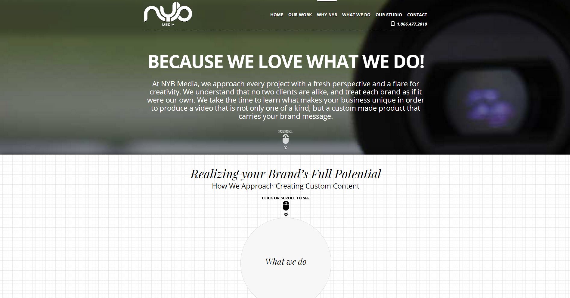
The recent drive toward better usability in website design has seen a rise in clean, uncluttered pages, with a focus on simplicity over novelty. As far as typography, that has meant a sharp decline in serif fonts. Rather than attempt to stand out with bold, outlandish fonts, graphic designers are keeping it simple with text that is easy to read and, more importantly, easy to skim.

There’s no shortage of typefaces available online, many of which come at no cost. More often than not, though, you can rely on one of the standards to get the job done. If nothing else users will appreciate the comfort of a familiar typeface; the proliferation of content doesn’t leave a lot of time or patience to adjust to new standards. Experimentation should generally be reserved for headers, logos and splash pages, although even there graphic designers can exercise creativity through positioning, colour and a host of other techniques beyond the typeface itself.
Attention to the Finer Details of Typography
But readability is about more than the typeface used. You may or may not be familiar with industry terminology such as leading, kerning and tracking, but you can probably appreciate when any of these values are out of whack. What’s most important is that the graphic designer recognizes as much. As content piles up, these details take on even greater significance, especially if you want your website to be a success.
It can be hard to appreciate the importance of typography until you’ve seen it done poorly. Good website design places the needs of the user front and center. Bad design, conversely, is all about the ego of the person creating it (or, in some cases, a complete lack of attention to detail). This can manifest itself in eye-catching features that, while nice to look at, lose their novelty in about five seconds, or in a number of other superficial elements. User-centric design isn’t just a buzzword, it’s a foundation of modern web design.
Finding Comfort in Contrast
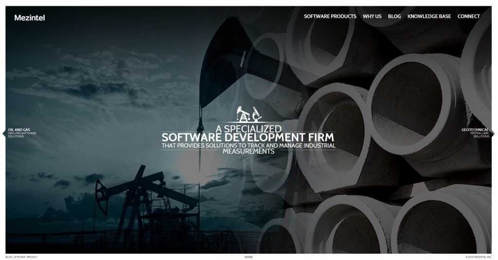
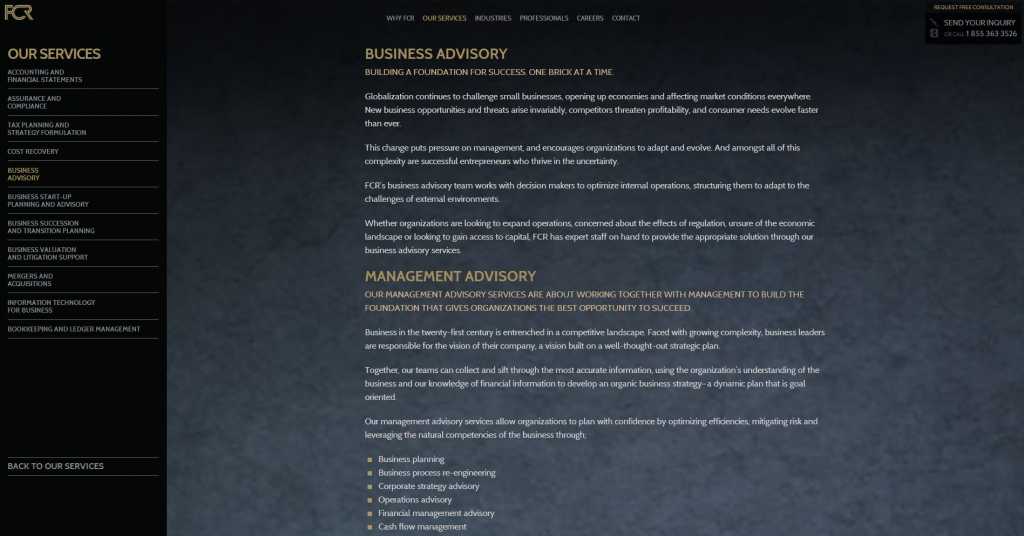
Although you would have a hard time drawing many parallels between modern web design and the very first websites, some standards have remained remarkably static over that time. Black text on a white background has stood the test of time, even while designers have experimented with just about every other possible combination along the way. White text on a black background has gained popularity among people who prefer the dramatic effect of darker websites, but anecdotal evidence and studies of reading comprehension continue to uphold the supremacy of the tried and true.
It doesn’t mean that typography ought to be limited to black and white, or that graphic designers don’t have creative freedom. But, in an era dominated by content, readability remains priority number one. Contrast is a leading principle in web design, both when mixing typefaces and colours, so it’s important to recognize the limits of experimentation and creativity. Every venture beyond such limits should come with a compelling rationale.

A Quick Note on Skimming
It’s no secret that skimming has replaced reading as the preferred form of content processing. And with usability all the rage in web design, it’s never been more important to segment that content. Large blocks of text alienate users, closing their eyes and ears to your message before they have time to give it a second thought. Subheaders, lists, columns, coloured backgrounds, bolded items—whatever the method used, graphic designers have to anticipate and cater to the needs of the user if your web copy is ever going to have a chance to do its job. Segmenting content makes it easier for users to decide what’s important and what’s less so (even if you think every word is sacred, give the audience an option to skim).

Establishing a hierarchy and breaking up content also has an advantage in the SEO department: when Google crawls a website it makes note of the way content is structured and organized. It knows that users don’t want to see a solid mass of web copy, and it ranks sites accordingly (the weight of such criteria is harder to identify, but you can bet if Google doesn’t like it your users won’t be impressed either).
Content-heavy pages require the expertise of a graphic designer to maintain order and keep users happy. The goal is not to wow them with design prowess, but rather to create such a seamless, intuitive presentation that they can lose themselves in the message. Ultimately, the best websites are the ones that compel users to stick around or to take action right away.
Typography has enjoyed a resurgence in web design thanks to an emphasis on content and on usability, leading to some impressive examples of creativity that demonstrate the enduring appeal of an ancient art. Still, unknowns lie ahead. For example it will be interesting to see how designers continue to adjust to the challenges of responsive design and multiple devices, much like they’ve been doing with images.
