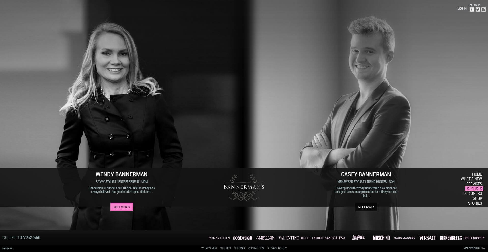
How Content Strategy Can Save Your Company’s “About Us” Page
BY ITW Consulting
Web Design and Development
Even in a world dominated by virtual connections, where face-to-face interactions have become the exception and entire businesses can function without the exchange of a single handshake, the human element still matters. In fact, for that very reason you could argue it matters more than ever. So how can your business establish a personal connection online without losing its professional credibility? For starters, you need a well-thought-out content strategy and an “About Us” page that puts your organization’s best foot forward.

You’ve probably already seen the most common templates for “About Us” pages:
- The storytelling approach, with fully developed characters and a tangible narrative
- The mission statement, with a strong but straightforward message about why we do what we do
- The company timeline, with milestones and images that show a progression
- The leadership team, with images and detailed bios of high-level employees
- The full team overview, with images and blurbs for everyone, even the office pet
Most brands trumpet their individuality in the face of so much sameness, yet it seems only a relative few have put talk into action. Web design companies are notorious for getting creative with their team pages—after all, they do want to showcase their artistic flair and technical prowess. But you don’t necessarily have to push the limits of website design to have an effective and memorable “About Us” page.
1. Show yourself
Team profiles are a simple way to introduce a little humanity on your site, in addition to providing a nice break from the stock photography or product images that prevail elsewhere. Many small businesses hesitate at the thought of shelling out cash for a professional photographer, but you don’t need glamour shots or anything more than you might find on LinkedIn.

For the sake of consistency and the website’s aesthetic, however, a photographer could prove to be well worth the investment—grainy, low-quality images can call your professionalism into question, while a complete lack of consistency (headshots mixed with full-body shots, casual shots mixed with formal shots, low-light mixed with lots of light) can create a disjointed look. Having nothing is better than having something awful; at least then you can retain some “mystique.”
A quick note on stock photography: don’t try to pass your team off as a group of models with picture-perfect smiles and impeccable suits. Not only will visitors wonder how those people can work for your company and still find the time to work for your competitors (there is a finite supply of stock photos, after all), you’ll squander the opportunity to convey your personality. Be skeptical of any web design company that touts stock photography as the way to go here; unless, as a last resort, they can find a creative approach that won’t cause you to lose trust with visitors.
2. Irreverent but not irrelevant
On a company website, how casual is too casual? At what point does being friendly become bad for business? These kinds of questions fall into the domain of content strategy, which your website design company should prepare in advance of content creation. Having a strategy will ensure you’re using the right messaging and tone for your target market, following a format that will augment your brand’s strengths.
By understanding the user and viewing them within the context of a potential relationship with your company, you can find the right approach to tell your one-of-a-kind story. Consider your own interactions in the role of customer or client—do you feel more at ease in the company of people who let their personality shine through, or do you want to put your trust in a strong, safe presence, one that’s all business? Again, it depends on the company, the audience and the product. What you can be sure of is that a strictly suit-and-tie profile that reads as though it was filtered by a team of company execs before reaching the website won’t do a thing to differentiate your brand in the minds of users. Safe, yes. Effective, maybe. Memorable? Forget it.
At the other end of the spectrum you’ll find “About Us” pages that eliminate all sense of mystery and take you places you weren’t ready to visit. They’re too informal, too buddy-buddy. In other words, it’s as if they’re trying too hard to set themselves apart, when a simpler, more honest approach would be best. Web design companies generally welcome the opportunity to do something unique for their clients’ “About Us” page, but it isn’t always in the best interest of the client or their audience. Sometimes web copy needs to establish authority, and it’s okay to keep your personal life separate. If that’s what it takes to instill trust in the audience, then don’t bow to the pressure of trying to reinvent the wheel or do something unexpected. Inject a little personality, avoid clichés, but don’t feel the need to reveal your idiosyncrasies just to avoid sounding stuffy.
3. Flaunt your assets—creatively
There’s a very real danger in talking about yourself or your organization: sounding like a complete blowhard. Yes, you want to make a great impression; yes, you want your web copy to communicate just how amazing and accomplished you are. But besides coming across as arrogant, you’ll put up a barrier between you and your audience. Content strategy should help you avoid this trap by identifying other ways to present your assets. It could be customer testimonials, hard facts about performance, a list of awards, links to shout-outs for your brand—anything but a self-indulgent rant that is impossible to back up and, quite frankly, a waste of bandwidth.
Likewise, avoid abstract language or promotional web copy that looks as though it could appear anywhere on the site (plain language is advisable for many reasons, but especially because it acknowledges the importance of other people’s time—who has time to decipher cryptic messages anyway?). Your “About Us” page is an opportunity to turn down the marketing noise and have a straightforward conversation. Don’t waste it.
4. Be responsible
Corporate responsibility comes in many different forms, from charity runs and “Movember” fundraisers to environment-friendly initiatives. Talk to your website design company about ways to incorporate your good deeds, no matter how minor they seem to you. You might not need an entire page dedicated to how fanatical your team is about recycling, but nearly every company can benefit from a content strategy that highlights those moments of selflessness. All things being equal, your company’s heart of gold could be what sets you apart from the competition.
